This is Part 4 of our Rebrand Story.
Part 1 Rebranding ILF: A Story of Change
Part 2 Our Brand’s Highs and Lows
Part 3 A Solidified Brand Profile
With the stakeholder interviews and brand profile complete, our team was getting in the groove. We were actively ticking off the checkboxes of the rebranding process with the help of Rethink (the company helping us through the rebrand process).
Next up, Rethink presented us with what they call “visual sandboxes.” This process involved …
Wait a second. This step was all about the images, colors, and design that would inspire the new ILF look, so let’s not make this post overcomplicated with a bunch of words.
Instead, let’s jump into the sandboxes we liked, the ones we didn’t, and the ones that made us go “hmmmm.”
The Sandboxes We Wanted to Play In
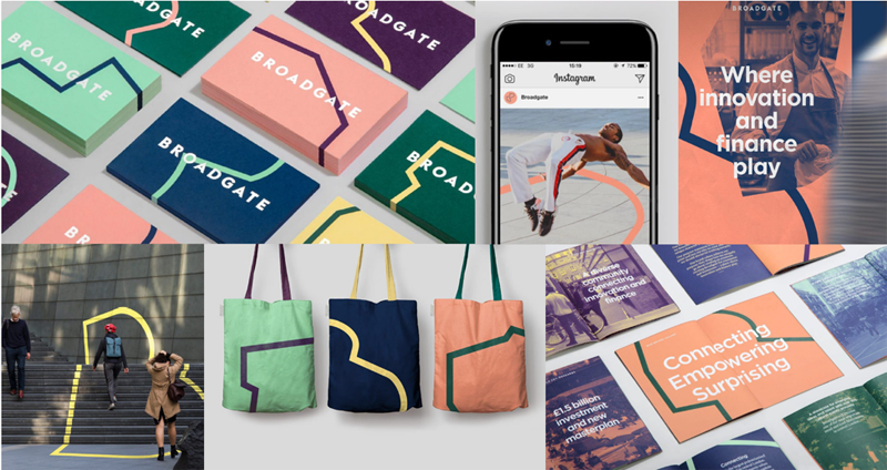
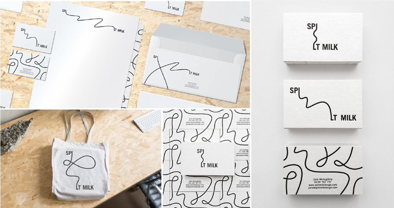
We loved the multiple colors, the simplicity of the name, and how the pattern separated onto different elements translated into a single image.
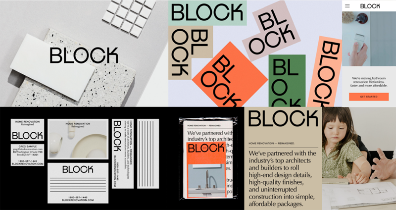
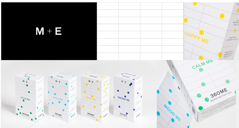
We liked the, well, blockiness of this one, the multiple colors, and the way the font also matched the blocky theme.
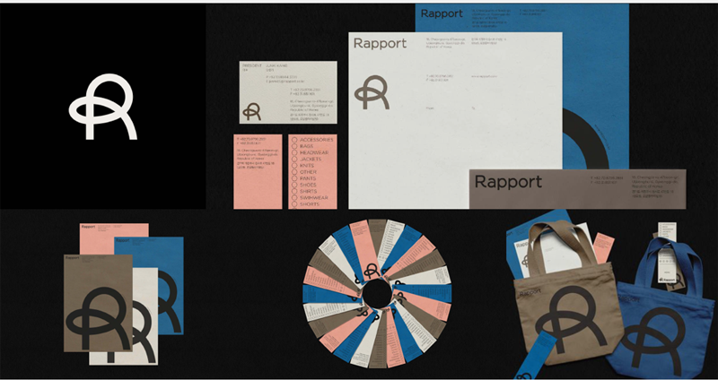
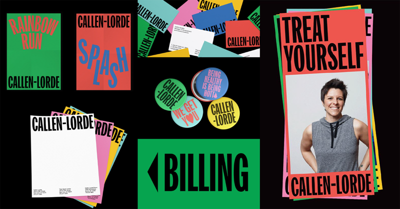
We liked the contrast of the stronger blue color with the softer pink color. We liked the rounded “R.” We also realized that given this, the previous blocky example might be too blocky.
The Sandboxes That Were More Like Kitty Litter Than Sandboxes
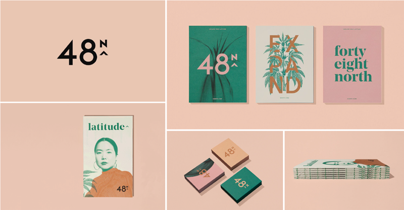
We actually liked the darker green in this one, but everything else was too soft and reminded us a bit of 80’s pastels.
We felt this was too confusing and hard to read. Plus, we wanted some color in our brand.
While it’s true that our team wants to move towards more evidence-based practices, this felt waaaaaay to clinical and scientific to represent our work.
The Sandboxes That Made Us Ask, “What’s Happening Here?”
Working with a big team of creatives at Rethink definitely has been interesting at times. Rethink always gave us a wide range of ideas and visuals to process. These design inspirations were …. well, you decide.
After the presentation and our feedback, Rethink sent off our chosen visual inspiration to their creative department to start working on the colors and visuals that would represent Indrani’s Light Foundation for 2019 and beyond.
Except there was one twist in the plan before we could move forward:
We decided to explore changing our name.
Wait, what?!
Get ready for the next post in our rebranding story. It will be filled with misfires, emotion, panic, blocks, and eventually a brand new name for Indrani’s Light Foundation.