Brand Ideas Stretched from 1 to 100
Many things stood out about Rethink’s process. (They’re the company helping with our rebrand.) One of the most impactful was that they made us take notice of their “1 or 100 rule.” Here’s what they said:
“Your best idea will either be your first or your hundredth, but you won’t know which until you’ve come up with all hundred.”
One of ILF’s core values is being adaptive. One of our core team beliefs is that we need to fail to learn. Rethink’s process that incorporated both adaptive creativity and 99 failures to discover 1 great idea matched our values and beliefs perfectly.
ILF Looked at All 100 Ideas
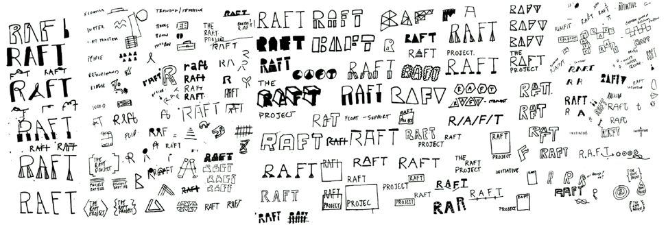
Let’s start with an image of a whole lot of “RAFTS” before jumping into some of the specific ideas we looked at more closely. Remember how we said it takes 100 ideas to find the best one? Here they are:
Rethink explained that the goal for all these different image and word explorations was “to find a conceptual wordmark or logo concept that could inform a larger design system.”
Of the 100 ideas, Rethink selected a much smaller number (8) to share with our team. Each one of them came with a theme to help explain the visual idea. Below we will share four of these 8 ideas that were culled from the 100. One gave us clear guidance on what we didn’t want. The team liked all three other ideas. Rethink developed these three further and eventually presented them to us as final logos.
1. Icons
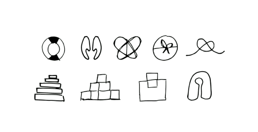
The first of these 4 ideas they shared as “icons.” These were a super helpful first share, as they showed us that we felt very unsure of an icon-logo. We learned we were probably looking for a wordmark instead of a logo.
2. Literally, a raft
This idea was based on the idea of resilience and protection combined with the shape of an actual raft:
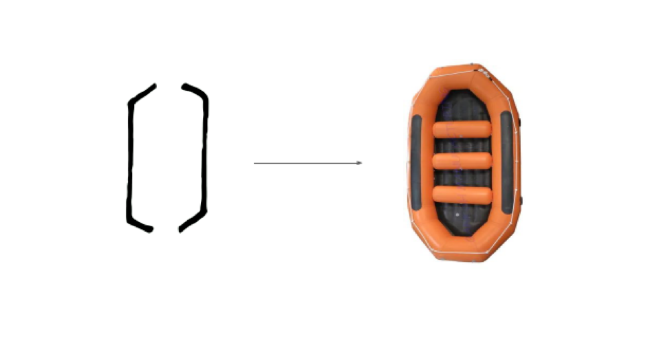
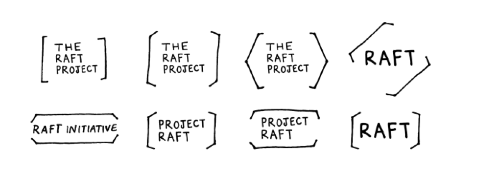
This was one of our favorite ideas. Although we didn’t want to have an actual raft as part of the logo, we loved the idea of the protective brackets around the name, and how we could use these brackets to brand different parts of the website, workbooks, and business cards.
3. Support
Another idea dealt with the concept of the actual wordmark showing support, to reflect the support RAFT provides to advocates:
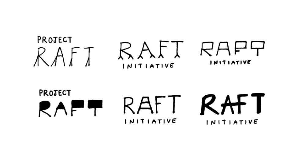
We felt that many of these wordmarks would be too difficult for people to read, feel too heavy, or that the wordmark would walk right off the screen. (So many little legs top row second from left!) What we did like in this group was the support shown by connecting the “A-F” in the bottom right wordmark. This was one of the main ideas Rethink moved forward with.
4. Building Blocks
Rethink used our curriculum as the inspiration for these wordmarks, building off the idea that our training provides Advocates with the building blocks they need to develop resilience.
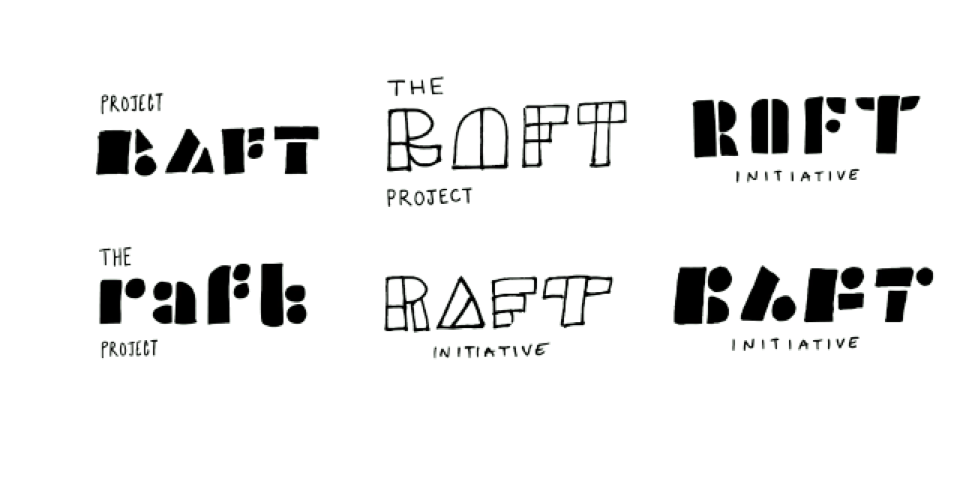
As a team, we were worried about the readability of some of these ideas, we liked the concept, the uniqueness, and the flow of some of these examples enough that we asked Rethink to explore this area further.
Deep Dive: the Final Step in the Brand Design Process
Rethink left the meeting with guidance from Team ILF to move forward with these three design areas. The next (and final) step in the design process was what Rethink calls a “Deep Dive.” Their creative team would fill out these three pencil-on-paper ideas and turn them into full designs that would then become the new RAFT brand. After this final design step, the website development would begin.
This is Part 7 of our rebrand story. Read previous articles about our rebrand below:
Part 1 Rebranding ILF: A Story of Change
Part 2 Our Brand’s Highs and Lows
Part 3 A Solidified Brand Profile
Part 4 Playing in the Visual Sandbox
Part 5 Naming is HARD
Part 6 Getting Through the Bad Names